Make the Mark
Give the strategy a form people can recognize.
A visual identity is how the strategy becomes visible.
We build identity systems that help people recognize the company, understand something about it before a word is read, and remember it after the interaction is over.
Start a projectThe mark is one part of the system.
A strong identity needs enough range to work across everything the business asks it to do. Depending on the engagement, the system may include:
- —Logo and mark systems
- —Typography
- —Color
- —Graphic language
- —Iconography
- —Illustration
- —Hand-painted logos and signage
- —Photography direction
- —Art direction
- —Layout systems
- —Motion principles
- —Brand guidelines
- —Templates
- —Physical applications
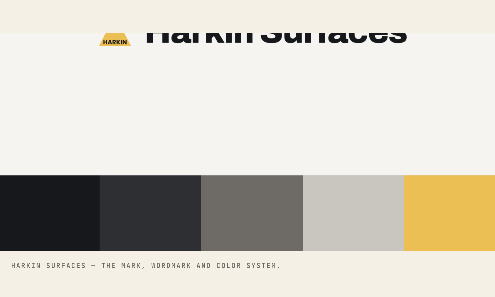
Every choice traces back to the strategy.
Identity work starts with what the mark and the system need to communicate.
Should the company feel established or disruptive? Technical or approachable? Precise or expressive? Premium or accessible? Heritage-driven or forward-looking?
Those decisions come from the strategy, the audience, the competitive environment and the truth of the business. Every choice in the system can be traced back to one of them.
Some marks deserve a hand, not just a file.
Hand-painted signs, sign painting and hand-rendered lettering are back on buildings, storefronts and packaging because people can feel the difference. A hand-painted logo carries evidence of the person who made it, and that evidence reads as care.
Where it fits the strategy, we design marks meant to be painted, lettered, burned, carved or built — then deliver the hand-rendered artwork alongside the digital system, so the brand works on a storefront wall and a phone screen at the same time.
Handcraft shows up in the system as:
- —Hand-painted logos and wordmarks
- —Sign painting and hand lettering
- —Hand-drawn illustration
- —Hand-painted wall murals
- —Storefront and building signage
- —Heritage-style brand artwork
Build something people can know before they read the name.
Strong brands develop recognizable patterns. The mark matters, but so do the typography, photography, composition, color, language, motion and hundreds of smaller choices people begin to associate with the company.
The job is to build enough consistency to become recognizable without making the system rigid.
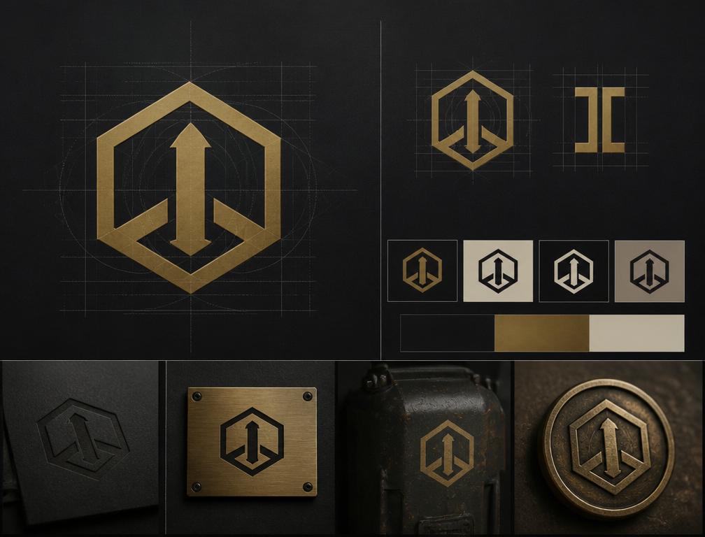
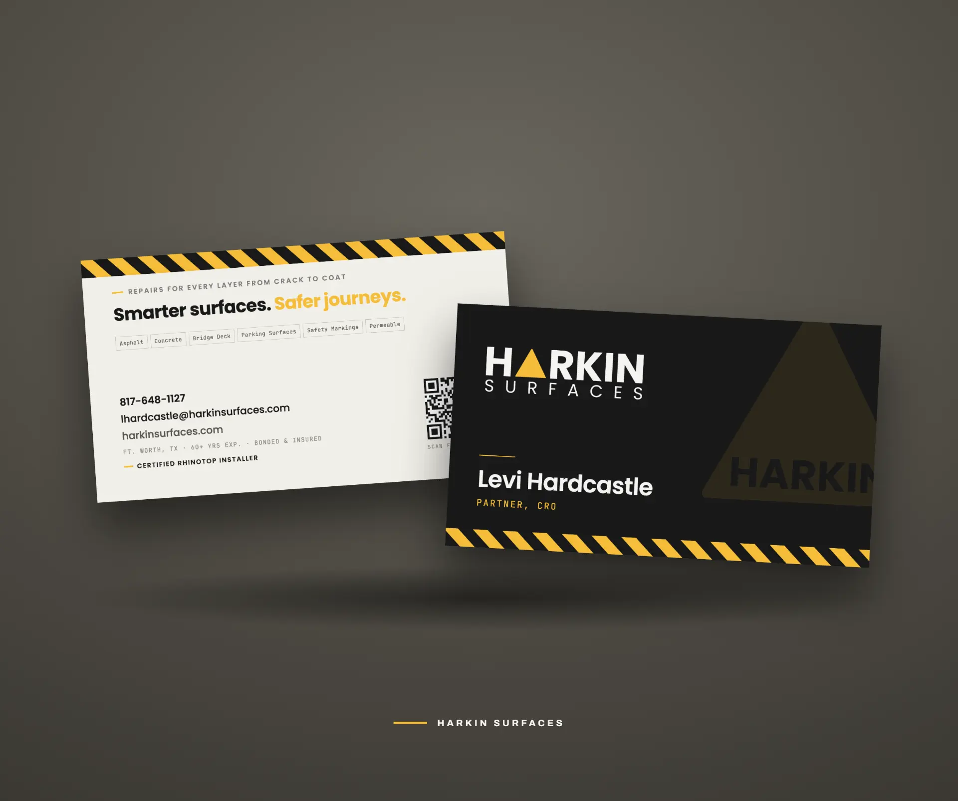
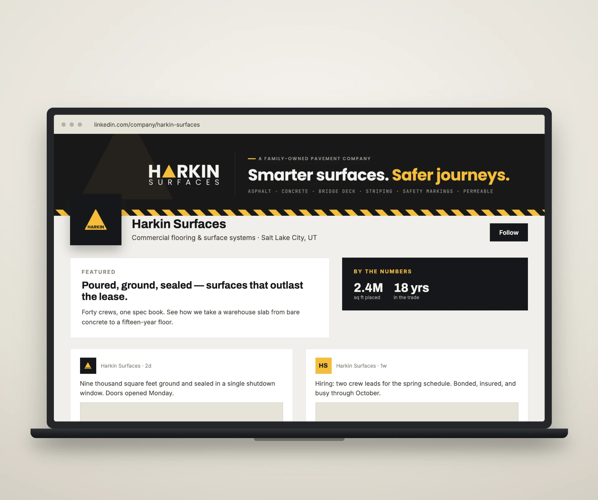
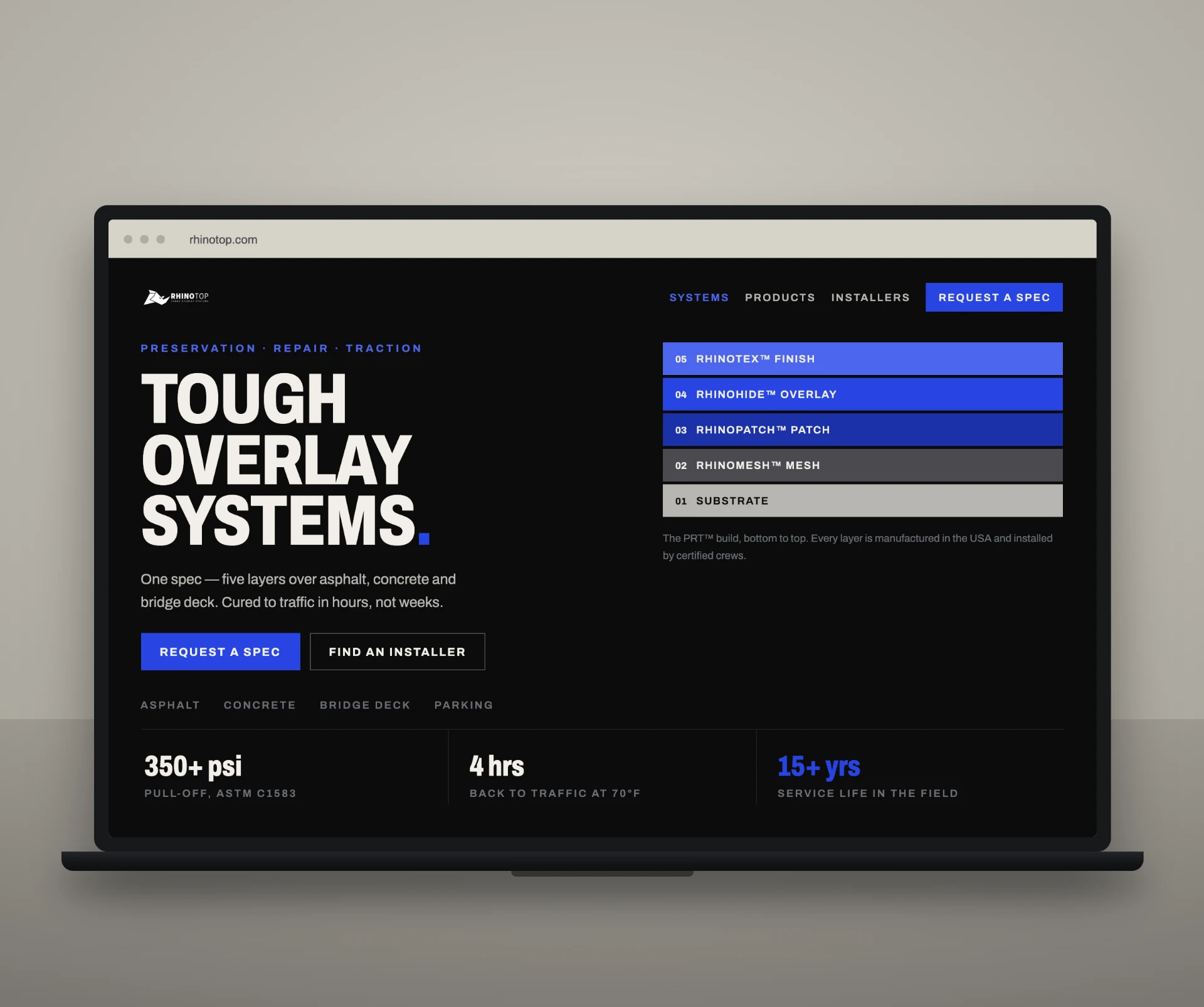
The system has to hold up in other people's hands.
Every system we build is designed around the people who will use it after we hand it over:
- —Internal marketing teams
- —Sales teams
- —Vendors
- —Partners
- —Developers
- —Photographers
- —Production teams
- —Future creatives
Guidelines are written for the next person who has to build something with the brand.
Then we give the identity somewhere to live.
Customers meet the brand through what it publishes, ships and shows. That is where we go next.
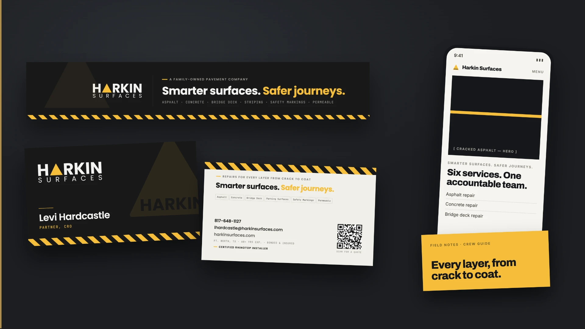
What this looks like in practice
RIDE FOR THE BRAND
Put your brand in good hands.
Tell us where the brand is and where the business is headed. Your business has already done the hard part — it's time the brand caught up.